Bringing a little more joy to the streets of India.
TOOLS
Illustrator, Photoshop, Procreate
TIMELINE
8 Weeks, Summer 2025
PROJECT OVERVIEW
Joybean sits in the mass-premium space — affordable, comfortable, and accessible, yet lacking the cultural edge or aspirational pull of a true lifestyle brand. Known for comfort and value, it resonates with practicality but not identity. For India’s growing generation of young, street-savvy consumers, that’s not enough. Drawing from India’s street culture, my rebranding proposal for Pulp India builds an identity that champions individuality, belonging, and emotional resonance, building a brand that’s not hypebeast or high-fashion, but culturally rooted, emotionally resonant, and modern.
Defining the brand story
DEVELOPING THE VISUAL IDENTITY
DEVELOPING THE VISUAL IDENTITY
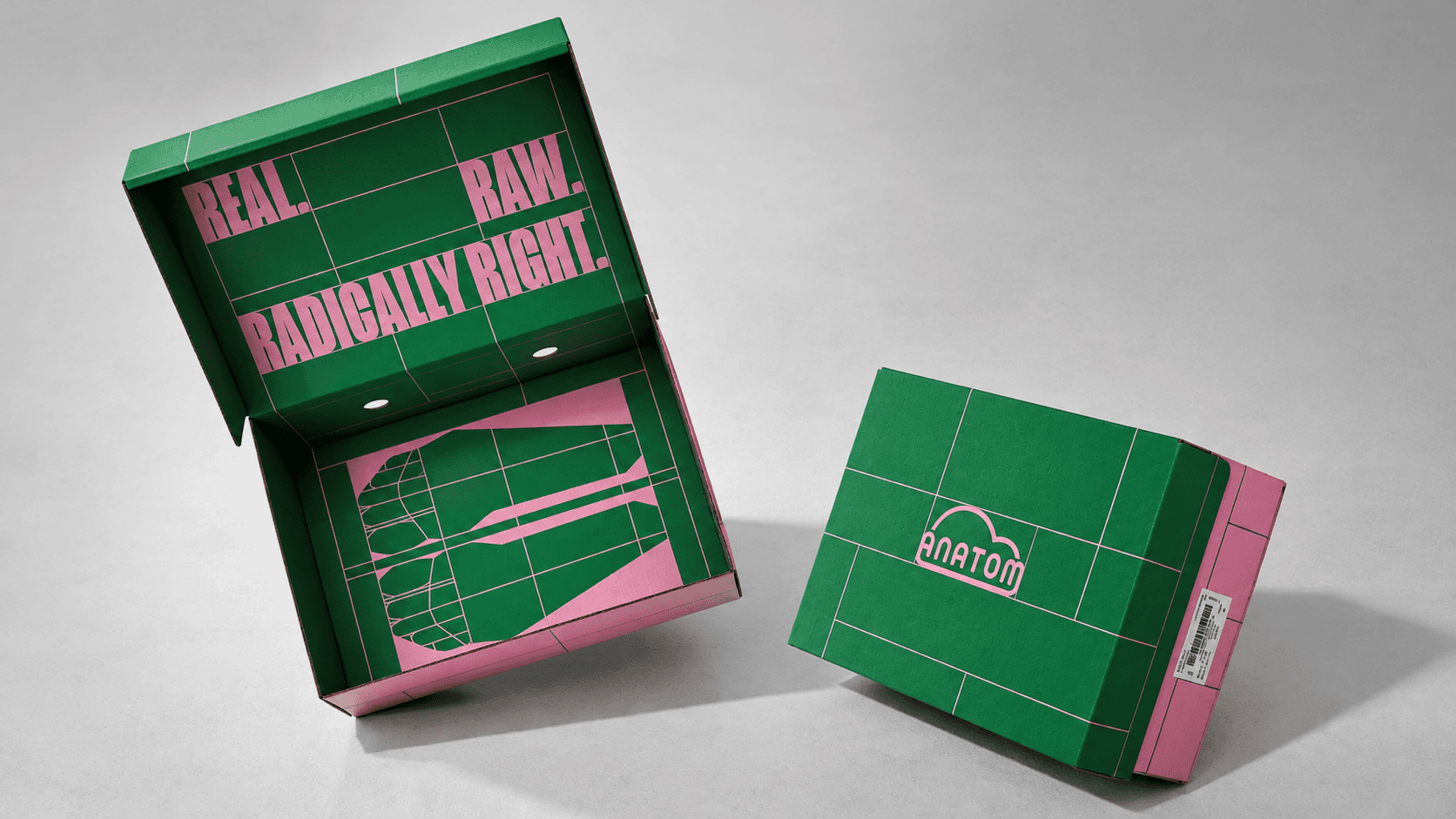
ANATOM
Real, raw, & radically right.
The first phase focused on shaping Joybean visual and emotional world. While the team deliberated a potential name change, we knew that “joy” would remain central. We wanted the brand to be a celebration of culture, everyday moments, and the energy of modern India. To translate this vision, I developed a series of exploratory posters, a preliminary type identity, and a set of brand pillar visuals. These helped the client visualize the desired direction —dynamic, raw and culturally expressive— for the world of Joy.
The State of Joy
At this stage, the brand had evolved to “State of Joy,” a name that captured its spirit of movement and celebration. The logo development process unfolded in two parts: first, crafting a distinctive wordmark that embodied the brand’s confident yet approachable tone; and second, designing a symbolic icon that could stand alone on the shoe — a simple, memorable mark that visually expressed the idea of joy.
Colour Strategy
The colour palette is built on a primary complementary colour scheme of blue and yellow, with secondary combinations including green and pink, and pale blue and orange. Contrast and visual interest are at the core of the brands identity, with colour serving as a key tool to convey its playful, bold and contemporary character.
The First Collection: Anatom
Anatom is State of Joy’s first footwear collection — and the one that set the tone for its identity. Built around the idea of reconnecting with the body through movement, the project reimagines comfort as something anatomical rather than cushioned. For the packaging—and for the whole world of Anatom, really—I wanted to lean into the anatomical roots of the brand, treating it almost like a study of movement and structure. The visual language of Anatom builds on that of State of Joy, but simultaneously takes cues from methodical, scientific visuals, which I translated through precise linework, diagrams, and mechanic-like detailing.


ORIGINAL LOGO
PROPOSED LOGO OPTIONS
#1.
#3.
#4.
#2.


LOGOS & ICONS
PROPOSED WORDMARKS




ABOUT
Final Thoughts
This series of explorations laid the foundation for a cohesive, flexible brand identity for State of Joy. While my involvement in the project concluded at the logo and icon development stage, these iterations capture the vision and direction for a bold, street-rooted brand that celebrates everyday movement, culture, and joy.
Dipika Sharma · 2026
dipikaannesharma@gmail.com
RESUME · LinkedIn

